Minutes - A Quantified Self App for Myself
I’ve long since 2014 engaged in some form of Quantified Self. It started with a simple Libre Office worksheet. I tracked my finances, sleep, time spent on entertainment, walking steps, and many other things. Maintaining a worksheet had a lot of flaws. I didn’t want to put my data in a Google worksheet, so it always remained on my laptop. Sometimes, I forgot to enter the data, and other times, I couldn’t access the device. There was also a limit on what I could track through it. I wanted to know where my time was going within a day. To manually enter everything takes a lot of time. I wanted something automated. I found many useful tools while trying to automate these things.
ActivityWatch is used to track everything you do on your laptop. It has quite an extensive set of features, but it was buggy. So I used it on and off.
Sleep as Android [Play Store] to track my sleep. With the help of this app, I found out how many hours of sleep I require to feel fresh. I still use this app.
I use the My Budget Book] app to track my expenses. It’s only available for the smartphone, so all the tracking happens within the phone. I manually enter all my expenses in this app right when I’ve spent the money. It works for all things except investments. I didn’t find a suitable solution for this. GnuCash seems close, but the account setup and tracking are a bit involved.
Nomie is a simple and quite helpful app. You create different “trackers” for things you want to track and just get started with tracking. Trackers can be count-based, time-based, or text-based. I’ve been using it for almost a year now. It gives a decent view of where I spent my day. It also has a rudimentary dashboard where you can add different graphs based on the trackers you’ve created. Notwithstanding the features, it’s slow, and I couldn’t agree with some of the design decisions of the app.
IFTTT is a tool to collect data from a phone and push it somewhere. I used it to track the time spent on calls and upload the records to Nomie (yes, Nomie also has an API). It used to be free before, but now it’s subscription-based, and their subscription model is costly. It also sometimes refused to work on my device. So I had to give up on it.
I didn’t stick with a lot of other apps because of a multitude of reasons. Some didn’t have data export functionality, meaning my data will always remain locked with them. Others didn’t let me use the app without an account. I am always sceptical about their security and data breaches, so I skipped those. Many others didn’t have cross-platform support. I either have to be stuck on my smartphone or my laptop.
After trying out so many tools, I know what exactly I want to track and how I want the app to look and function. So now, I’ve started working on an app for personal usage. The starting point for it is going to be Nomie. I’ll skip all the things I don’t want. I am going to call this app Minutes.
I am going to use Flutter for this project. Flutter will give me native Android and web apps. That handles the cross-platform support I need for the app. I am going to document my process of building this app. I’ll discuss all the design decisions along with the final output. I’ve never created a smartphone app before. So this blog series is also going to be a documentation of my learnings as well. Flutter uses Dart programming language, so this is also an opportunity to learn Dart. Yay.
Let’s get started with the first part.
Flutter Documentation
The getting started page really gets you started with everything required. It takes time to set up everything as it downloads many things. I did the setup in Linux and macOS. Linux took some figuring out a few path issues, but macOS was straightforward. It helps you set up your IDE as well. There are three available IDEs - Android Studio and IntelliJ, VS Code, and Emacs. I am sure there’d be support for other editors as well. I use VS Code, so everything was smooth for me.
Building the first app was also very effortless because of this well-documented tutorial. The dopamine hit of installing Flutter and creating a hello world app in a single sitting was satisfying.
I understood the basics of Widget, StatelessWidget, and StatefulWidget. While creating the State class corresponding to the StatefulWidget, the class name is prefixed, by default, with an underscore (_). That ensures privacy in Dart. It’s a bit similar to Python, where class methods prefixed with a single underscore are informally considered non-public methods. There’s also a good collection of icons available in Google’s Material design features, which you can directly access using Icons.<icon_id>. There were other things that I didn’t understand and just copied from the tutorial.
Hot reloading is also a cool feature. It hugely reduces the development time.
Minutes Homepage
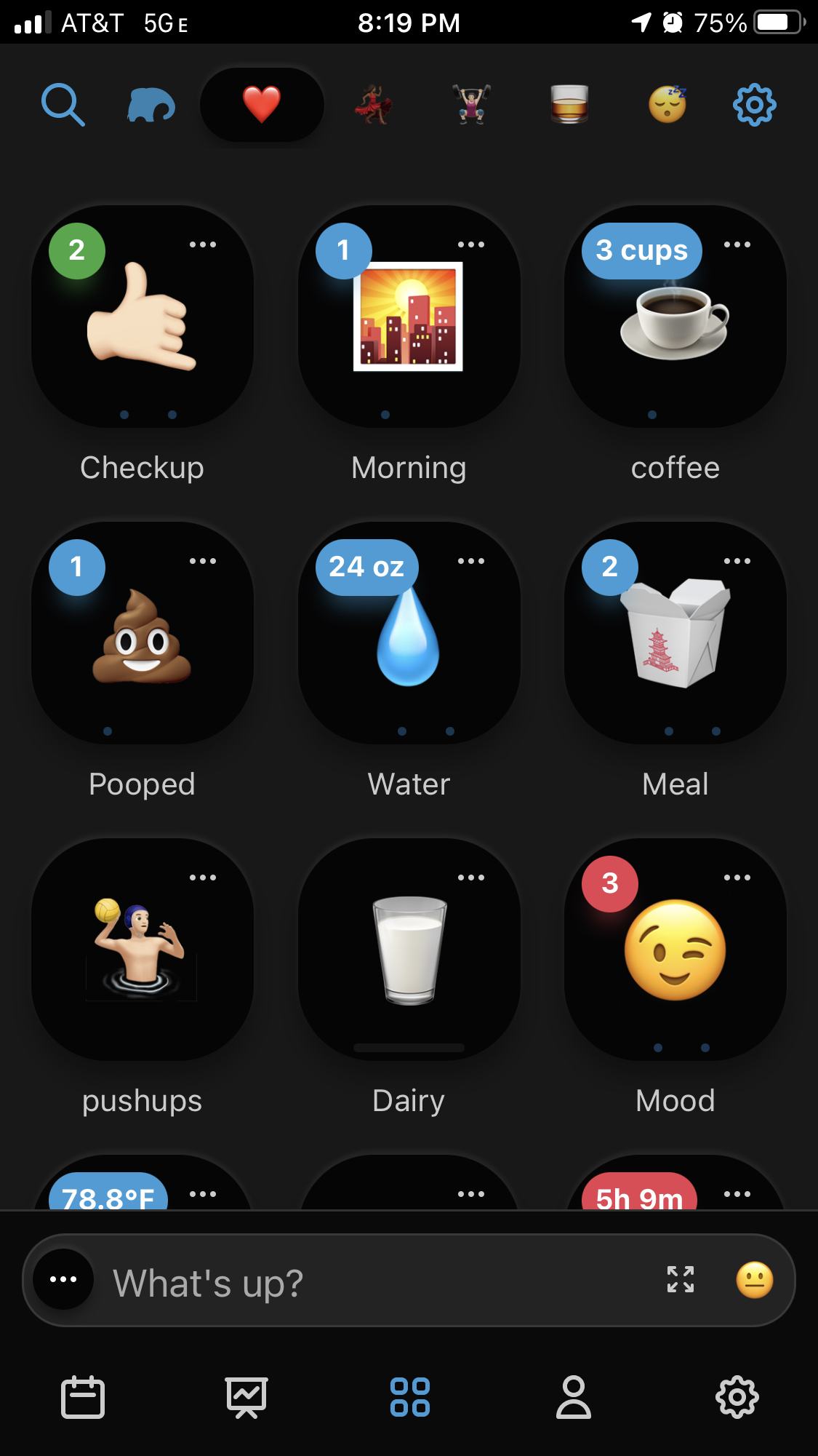
Let’s discuss the first looks of Minutes. After working through the basics, I started cloning Nomie. I first want to replicate the tracker tab. That is how it looks in Nomie:

The first thing from this page I am going to copy is the bottom navigation. I followed this 2018 article. It almost got me to the final thing. There were a few hiccups.
First, I had to remove the deprecated parts of the code while building each tab in the bottom navigation bar. The original snippet was this:
BottomNavigationBarItem(
    icon: Icon(Icons.home),
    title: Text('Home'),
)
With the help of the flutter dev documentation I converted it to this:
BottomNavigationBarItem(
    icon: Icon(Icons.home),
    label: 'Home',
)
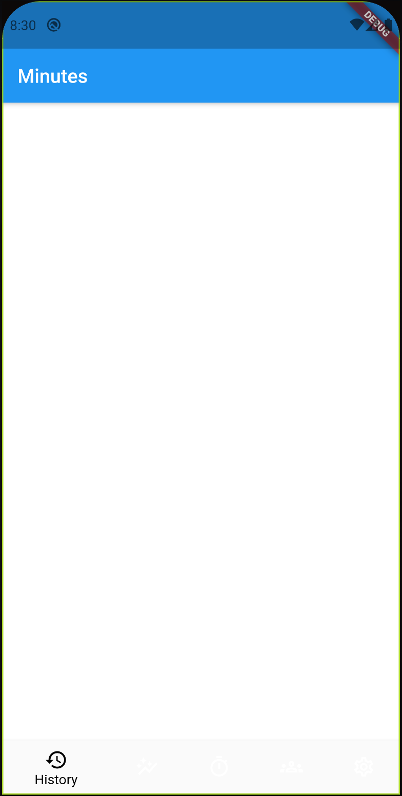
The second problem was much more worrying. When there were three buttons (as were in the blog post), everything worked fine. Though, when I added two more, all the buttons except the active one became invisible. You can see how weird it looks:

I looked around and found a Github issue on the flutter project. The issue was that when more than three BottomNavigationBarItem items are there, and if unspecified, the type of the BottomNavigationBar changes fixed to shifting. This change makes the text and items render in white. One of the comments explains the reasoning behind it. So, it’s a feature, not a bug. Explicitly specifying the type as fixed, fixed the problem:
bottomNavigationBar: BottomNavigationBar(
    type: BottomNavigationBarType.fixed,
    ...
)
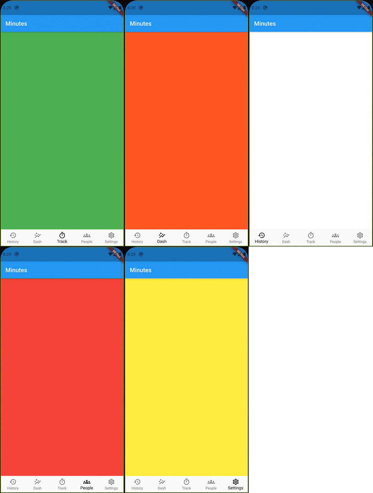
And, this is how the Minutes Homepage tabs look right now. When you open the app, the first tab is the “Track” tab. Colours are to add some dummy action on button click.

The next step is to add trackers to the Track tab.