Chatting Up - Part II
In this post, I have analyzed my WhatsApp and Facebook chatting data. I have been emailing myself WhatsApp chats regularly, and Facebook chats were a part of the data dump which you can initiate from your account settings. Then I wrote some code to parse the data out and create one consolidated csv of chats.
The first part is here. It was largely derived from this amazing post by Stephen Wolfram, creator of Wolfram Alpha and Mathematica. This present post is all me. I have been at it for 2-3 weeks now, mostly late nights after work.
I have Facebook records since 2009, but in case of WhatsApp, it only starts from 2014 (when I realized, I should start saving these chats). Out of 2,242 days, between 2009 and 2018, I was only active during 1,935 days. Thats, 86% activity. During these 1,935 days, the total texts, sent or received is 299,764 (119,042 sent and 180,722 received). These ~300K replies contain a total of 1,815,134 words (872,940 written by me, 942,194 written by my friends). To give you something to compare with this number - War and Peace has around 561,304 words, Lord of the Rings series has around 828,045 words, and the Harry Potter series has around 1,084,625 words. I alone, have written material equivalent to LOTR in quantity, let alone, what my friends and I can do together. Jokes aside, while doing this, I realized, we write A LOT in our daily lives without even thinking about it much. I am just analyzing chats here, but there are emails, blog posts, tweets, FB posts, SMS, code, and whatnot.
WhatsApp conversations happened only on my Android (no WhatsApp Web or emulators). In case of Facebook, during college, I used Android Messenger and Facebook website, intermittently. Post graduation, majority of the chats were through messenger. Out of the 299,764 texts, 12.4% were on WhatsApp and 87.6% through Facebook.
Assuming, reading/writing all the texts within a minute took me that whole minute, I spent 102,511 minutes (or 1,709 hours, or 71 days, or 2.4 months) of my life, just chatting. Naturally, actual time will be lesser than this, but this is the closest we can come to calculate this number. During each minute of these 2.4 months of continuous conversations, for every text I sent, I received two replies back. Now, this 1:2 ratio suggests that I am not as active as the other person, but later in the post, I’ll give evidence which will suggest otherwise.
Here’s the daily footprint of my chats.
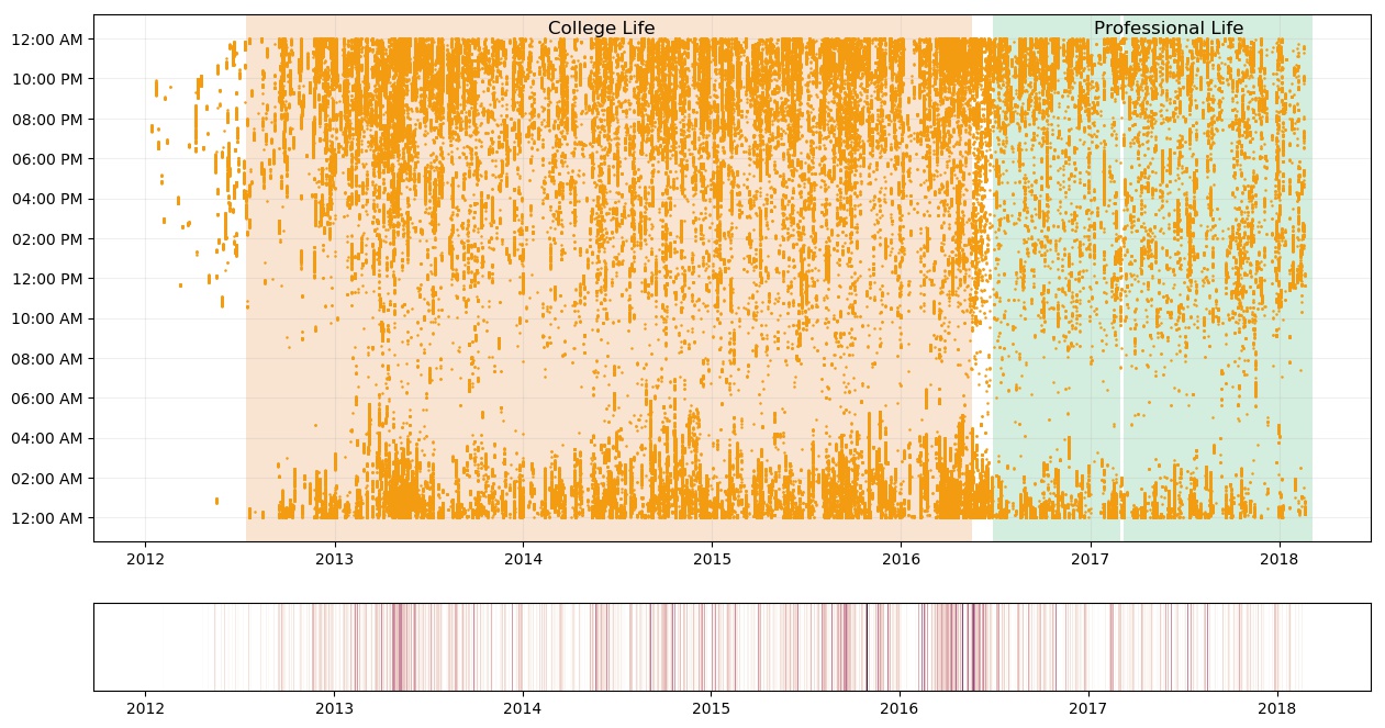
There are 3 highlighted regions - College Life, Professional Life (2 different jobs). Most of the college segment was discussed in the first part. Lets discuss the time of end of the college and the job life.
If you look towards the end of the college (May 2016), there’s a huge surge in conversations. There were many reasons - final year college project discussion with project partner, long chats with some friends, farewell, last day, saying goodbyes. This was also the time when I played some puerile truth-dare games in group chats. I had participated in six groups during this time - May 2016 (three in April and two in June). Another interesting thing is, between the time the college ended and the job started, how the last reply at the night shifted from 4:00 AM to 2:00 AM.
It’s obvious, I was pretty active during college than now, but largely, the active hours remains late night. Throughout my professional life, there are gaps (mostly, half a month) during which, there were no conversations at nights - those were my “late night at work” days. Overall, my conversations during day (relative to nights) have increased post college. This is apparent from my day-to-night activity ratio bumping from 0.22 in 2016 to 0.53 in 2017. My chats at night, during professional life, hardly goes beyond 2:00 AM, owing to going on time to office the next morning. Similarly, during that time, my chats during the day mostly start after 10:00 AM. This, again, is because, I chat during commute or after reaching the office. If you look carefully, the conversations are intermittent, that’s because, I send a reply then do some work and then reply again if the other person has responded.

The 1st plot shows the hourly count of texts. The part between 5:00 AM and 9:00 AM is pretty much zero. This plot specifically shows, I was highly active from 8:00 PM to 2:00 AM. There’s a rapid increase from 5:00 PM till midnight and then a rapid decrease after midnight. In the 2nd plot, my conversations are higher during the weekend with a maxima on Sunday. This was expected.

The years, 2015 and 2016 were the most active years in terms of total traffic. Comparing 2015 and 2016, my friends talked more during 2015 than in 2016, whereas, I talked more during 2016 than in 2015.

This plot shows some features which were not visible in the yearly plot. Firstly, there’s a dip in the first month of each year, except 2015. This is usually the winter break; internship or traveling are the likely reasons for these lows. There’s a huge peak during 2016 first half - the last semester of the college. The reasons for the peak were discussed previously.
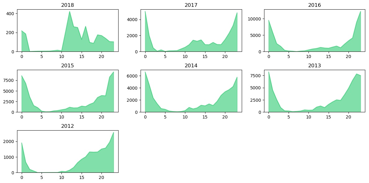
The above plot shows the hourly distribution of conversations for each year from 2012 onwards. Let’s start from 2012 (bottom left).
In 2012, most of the conversations were after joining the college in July’12. The slope starts increasing after 3:00 PM. That’s because the college, for most days, got over around 1:00 PM or 2:00 PM. Most of these conversations are with Duffer (name masked for privacy :p). Majority conversations were over before midnight. In 2013 to 2016, however, things got flat during the day, even around 3:00 PM. The high traffic shifted to 8:00 PM and majority conversations shifted to later during the night (2:00 AM or 3:00 AM was the usual). The year 2016 is specifically high in text count during late night. Now comes the year 2017 (Post college days; professional life). The overall traffic lessened during 2017 and a new peak formed between 10:00 AM to 3:00 PM. These were the short conversations with working friends or new work friends, during the day. If you look carefully, my conversations during nights have decreased in 2017, although, still the peak time. Things look different during 2018. Though the data is of only 3 months, the conversations were clearly low. Nighttime is not the peak anymore now. And things have gone higher during the day. I wonder how the pattern would be at the end of 2018.

The above two figures show count wise and size wise cumulative plots of the replies. The pattern is almost the same in both the figures, but still there’s a difference. The 1st plot shows that my friends sent me way more messages than I had sent them back. I am almost guilty of being a lazy ass from this plot. But! But! And, here is my proof, that I was not as lazy as it seems. The second figure shows the cumulative plot of reply sizes. If you look at it, the line of incoming (orange) and outgoing (green) are very close. The small gap which is still there, is because of the group chats, otherwise, the lines mostly overlap (I checked this). The conclusion is, even if I reply less, I make up for it by writing long replies.
Other than this, there are two major bumps - mid 2013 (May'13) and mid 2016 (May'16). Mid 2013 is a month before the summer break and almost a year after I joined the college. Mid 2016 was the end of college and I have discussed it quite a lot during the previous few plots.

The above plot is my monthly average of the friends I talked to. Observations prior to 2016 were discussed in part 1 post, so here, I’ll talk about the period during and after 2016. You can see, on an average, I talked to six friends during May’16, the highest in 2016. This was the last month of college. Interestingly, six was also the highest during May’13. There were a total of 30 and 31 friends I talked to, during May’13 and May’16, respectively. Out of eleven common names, only two were outside college group.
Let’s discuss some friends wise analyses. Names are masked for privacy reasons. But the mentioned individuals will identify themselves from the masked names. So win-win, I guess.

The above plot shows the top 20 friends arranged by the count of days on which we conversed. You can see, only three individuals cross the one year line and only one person goes beyond two years. Duffer tops many lists along with this one. I have talked to him quite a lot.
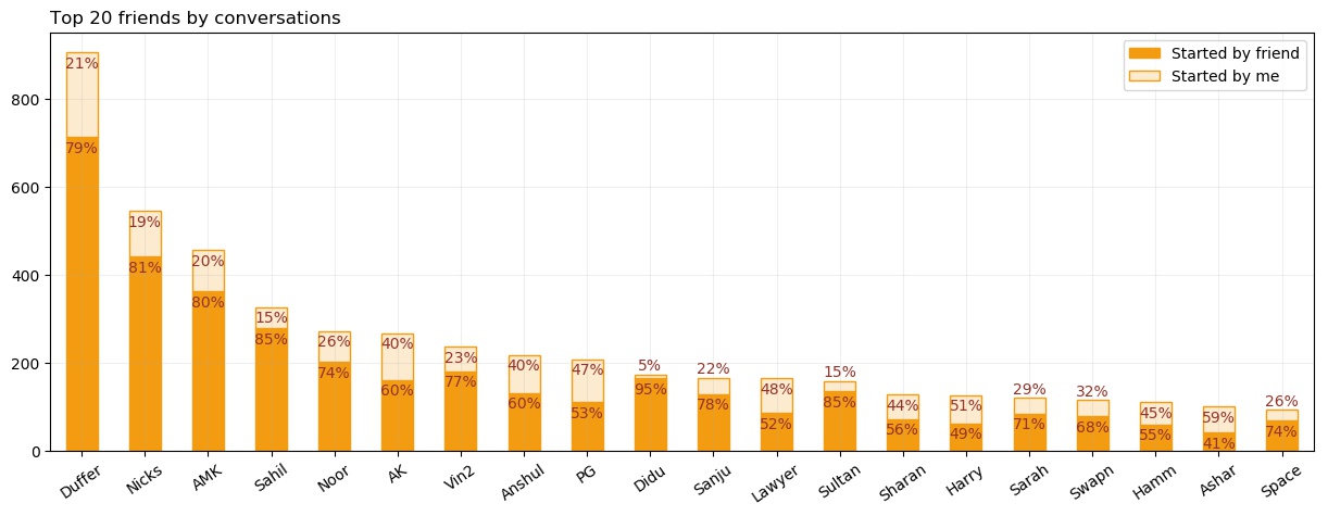
This plot tries to quantify how many new conversations I had. A new conversation is taken as any message which was sent after 8 hours from the previous text. There would be very few conversations which were continued after 8 hrs gap. However, there might be many which were under 8 hrs, but if I reduce the threshold, then I take the risk of getting more false positives. So, I stopped at 8 hrs as my threshold. One way to see if it worked is by comparing this plot and the previous one. Both have same y-scale, that is, number of days talked and number of new conversations are in approximately same. This makes sense. If I talked to someone last night and I am barely active during the day then, next night conversation will be, almost always, after an 8 hr gap. This gives us two new conversations on two different days.
One surprising thing present in the plot is, with most of the friends, my tendency of starting a conversation is quite low, with a minimum being 5%. This is probably the first learning from this analysis. I should initiate the conversations more. It is a relief, though, that I participate equally once the conversation starts.
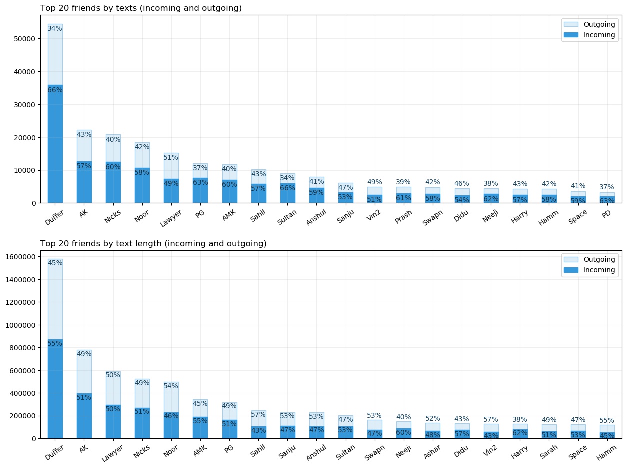
These above two figures again show the difference between my reply count and reply size when divided by top friends. Duffer is at the top. Many friends swap places in between the plots, but more or less, they are same. I am again saved by the 2nd plot.

Here I have plotted for the top 20 friends by the reply count, the average reply size. The bars are arranged by avg mean length of the reply by the friend. Yes! Here my avg is better for almost every friend. So, this is the final evidence that I am not lousy at replying. My replies are lengthier and hence my reply count is low.
Here, Lawyer tops the list. Duffer went down to the 10th spot.
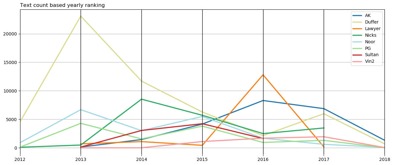
This kind of plot is called a parallel plot. For the selected friends, I have plotted reply counts for each year. I wanted to see with whom was I most active during that particular year. Duffer was at the top during from 2012 to 2015. In 2016, Lawyer beat everyone for the top. And in 2017 and 2018, AK came on top.
Duffer and I used to talk a lot, but then we were kinda out of topics after three years, and we both got into different things. In 2016, Lawyer and I were in a relationship, so naturally, she topped the list. I didn’t talk much to others during that time, except AK. AK and I, both got into Opera Solutions, so we had a lot of conversations post college, leading him to top the list in 2017. Duffer also made a comeback in 2017 by being 2nd.
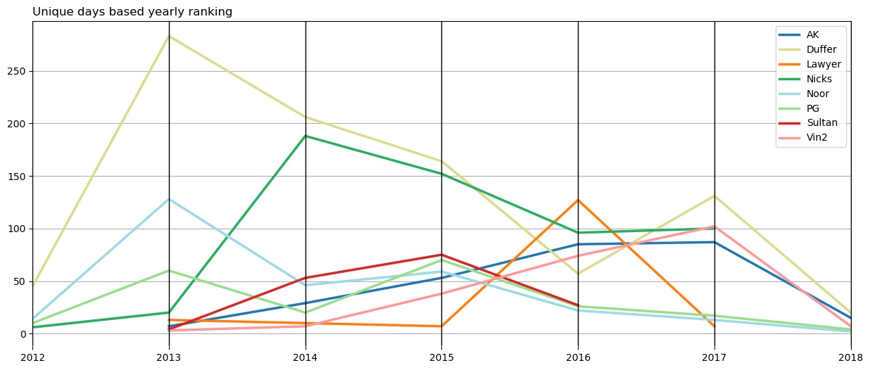
This is a parallel plot of number of unique days, I talked to that person per year. Duffer tops from 2012 to 2015, same as last plot. Lawyer tops in 2016. In 2017 and 2018 though, Duffer replaces AK. So, overall, Duffer tops in every year except in 2016. I hope these analyses don’t look like I want to show where Duffer came first. This next plot should take care of that.
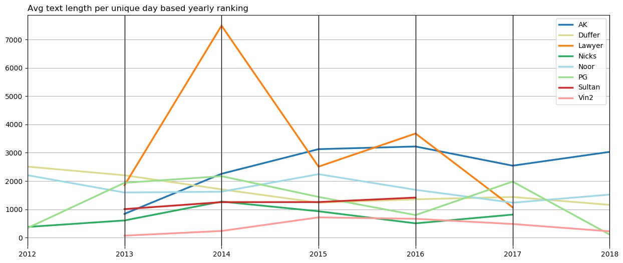
This plot is interesting. Two specific friends - Lawyer and AK - with both of them, the average text length per day is higher than others, except in 2012. That’s probably because, with both Lawyer and AK, I have had long discussions about many interesting things. And, they usually involved to-n-fro of some long arguments. Most notable is the year 2014, where with Lawyer, average length reached more than 7,000 character. As can be gathered from the last plot, during the period prior to 2016, Lawyer and I talked on very few occasions and this probably inflated the average.
Another interesting thing is, even though, I have talked with Duffer a lot, our average length is low every year. This could indicate that we haven’t conversed using long sentences. This could also be, which is more likely, that because we have talked a lot (100+ separate days during most of the years), the average was brought down by a large number of small texts. We must have talked with long sentences on some days, but on majority of days our texts would be short and hence the average would also be low. Although, I suspect, this average would be close to the actual average.
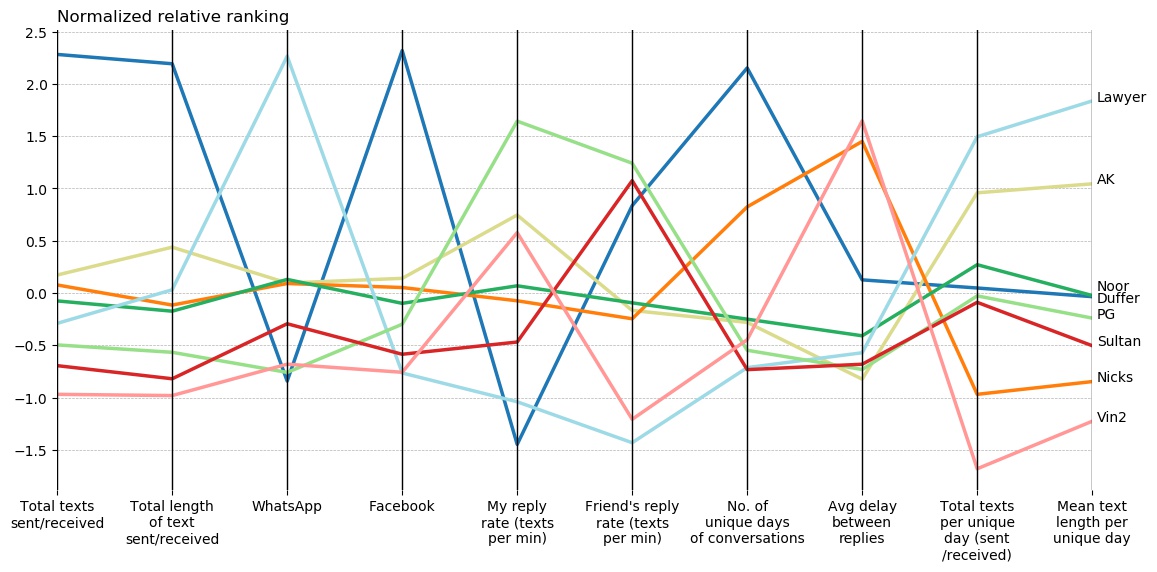
This is a parallel plot where each friend is ranked on various measures. There were far many measures, but to not to crowd the plot, I have limited to 10 metrics. You can see how each friend does across the metrics. Parallel plot was the most relevant plot, I could think of, for this kind of relative ranking across multiple measures. Also, each metric was normalized to bring everything on the same scale for the plot. So, if my reply rate and my friend’s reply rate (5th and 6th vertical line in the plot) are not on the same level, that doesn’t mean we have a gap in our rates. It’s just normalized according to other values in the column.
Lets take the example of Duffer (Dark blue line) to walk through the plot. We have high messages counts. Messenger is our common mode of conversation. My reply rate is lowest for him (this is biased - since we have talked a lot, there will more instances of delay during replies). His reply rate is high though. So, he is, more active responder than me. Average delay between our replies is okayish. Our total replies and mean text length per unique day is at the center (meaning, they are closer to the average of all the values for that metric).
We can also get other interesting bits from the above plot. For the Lawyer, the major mode of conversation is WhatsApp. My reply rate per minute is highest for PG. Average delay between replies is lowest for AK. We both usually have latency free conversations with each other. Total unique texts per day are the lowest for Vin2.
Below is the cumulative text count plot for the top 10 friends.
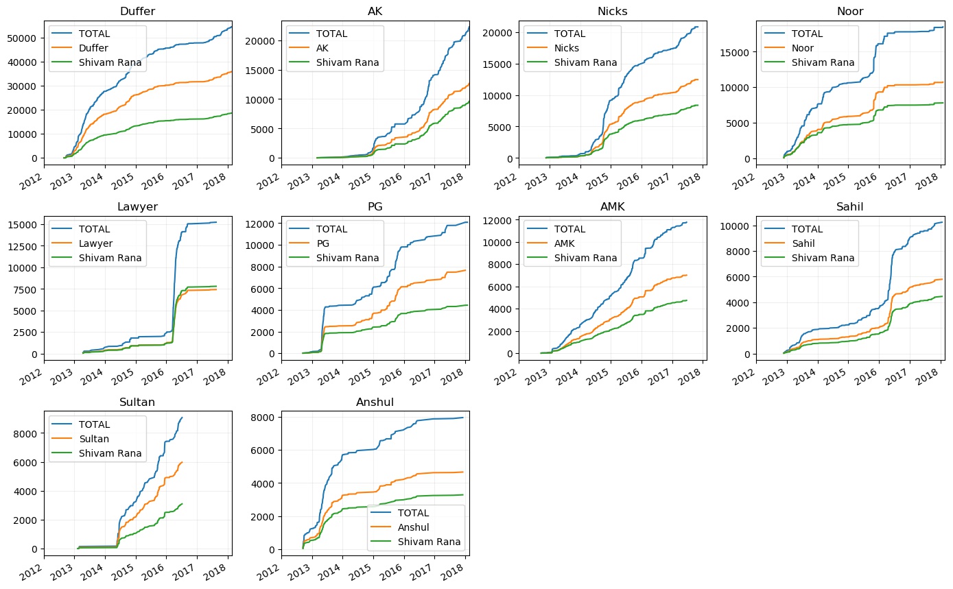
Enough discussions have been done on Duffer. Lets discuss others. With AK, things started from 2015. I cant seem to remember how it started but it was on-off till 2016. From 2016 we picked up the pace. Then we also went to the same company so things have been pretty active, such that, he reached the 2nd place based on the text count.
Things plateaued from mid 2016 to early 2017 for Duffer, Nicks and PG, because they were preparing for an exam during that time. With Lawyer, only bump is during 2016 when we were dating. other than that the plot is flat. With AMK, consistent chats happened till 2017 after which we haven’t talked.
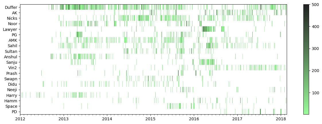
This is the heatmap for the frequency of chats each day through the time scope. Note that, I have limited the colorbar till the frequency of 500. There are some instances where the frequency is higher than that.
All the previously discussed frequency patterns can be seen here easily. Duffer is most green throughout. There are a few dark green lines, but mostly the frequency is towards the slightly dark green. AK’s green lines are towards the end, and there are many dark green fringes explaining his reaching to the 2nd spot. Nicks’ is also green for most of the part, but it is mostly light green and slightly dark green, because, we usually just catchup and then end the conversation. Lawyer has dark green segment only during 4-5 months of 2016. (I just realized, each of these horizontal bars look like sound pressure waves. I wonder how each friend will sound like.)
One thing, that I thought would be interesting was the application of Poisson’s Distribution on the data. Poisson distribution is the distribution of number of events occuring in a given time period. So, if your data follows that distribution, then you can find the probability of number of times that event is going to occur next. My data was how many new conversations do I have within a day. So, I can find the probability of the n new conversations I’ll be having the next day. Sadly, the data didn’t follow the distribution. The goodness of fit test, which is used to check whether a data follows the distribution, gave a very very small p-value rejecting the null hypothesis (null hypothesis was that data follows the distribution). :(
These were some of the analyses I did on the data. There is much more that can be done. Some of them which were not included here, can be found in the github repository in the Jupyter Notebook. The data preparation and other related code is also there.
Another thing, which I haven’t delved into, is the text analysis. Some interesting analyses can be:
- Finding out the proportion of content/non-content data in the text. Non-content data means words like “ok”, “okay”, “hmmm”, etc;
- Use of emojis;
- Conversation starters;
- Conversation endings;
- Web links shared;
- Change of conversation starter words with time (overall and friend wise);
- Topic modeling;
- Sentiments;
- Graph of connections - I have my side of information where I can make a graph of friends and the groups they were in with me.
These are just from the top off my head. There would be many more which I haven’t even thought of. But this is all future work. How else will I create a part 3! Huh?