Gene Regulatory Networks
Here goes the documentation of the work I did during my summer internship. Yeah, I know, this is coming quite, quite late, but hey! Better late than never! All the coding was done in R (check out the repo). There will also be another post which will talk about the technical (basically, R code) details.
Objective
A Gene Regulatory Network (GRN) is a network between various genes and proteins that interact with each other and govern each other’s expression levels. Genes may have a positive or negative effect on other genes, it is these effects which are shown in a GRN. Microarray Data or Gene Expression Data represents the expression level of various genes under certain experimental conditions (either under some perturbation, or for various patients or at equal time intervals). The objective was to model the GRNs using the microarray data.
Motivation
So, why Gene Regulatory Networks?
GRNs have an important role in every process of life (for eg; cell differentiation, metabolism and even sleep). A few months back, I read an AMA where the researchers study how day-to-day sleep behavior is regulated. They use genetic data in their study and in 2009 they discovered a mutation in a gene that allows a person to get a fully refreshed sleep in 4-5 hours of sleep. Read the whole AMA here, you might also find answers to some of your sleep-related questions. Anyway, the way they are doing the study is,[read the answer to the question]
The way we are going after this is by first getting a handle on what the regulatory pathways are for normal sleep regulation. Then getting an understanding of what makes these processes more efficient.
Thus, you see the application of GRNs. It is important to emphasize that, the inference of gene regulatory networks is not the final result, but these networks are supposed to help in solving a number of different biological and biomedical problems, as the AMA also shows. Some ways in which GRNs can help are discussed in the following sections.
Causal map of molecular interactions
The most common use of the GRNs might be to serve as a map or blueprint of molecular interactions. Since, GRNs represent causal biochemical interactions, a biological hypothesis about molecular interactions can be derived using these networks and tested in wet lab experiments. An important aspect of this causality is that GRNs represent statistically significant predictions of molecular interactions obtained from large-scale data. Given the very large number of potential interactions (between ~20,000 genes in Human), the GRNs are of tremendous help in narrowing these numbers down to potential interactions for which statistical support is available.
Comparative network analysis
When more and more gene regulatory networks from different physiological and disease conditions become available, there will be a possibility of statistically comparing these networks. This will allow to learn about interaction changes across different physiological or disease conditions and enrich our biological and biomedical understanding of such phenotypes. It might be challenging to determine which similarity or distance measures are suitable to perform such a comparative network analysis and different types of networks, as well as, different biological questions may require different approaches.
However, in order for this approach to succeed it will be necessary to establish databases, similar to sequence or protein structure databases, that provide free access to the inferred gene regulatory networks from different physiological and disease conditions.
Network medicine and drug design
For establishing a network medicine useful for clinicians, it will be necessary to integrate different types of gene networks with each other, because each network type carries information about particular molecular aspects. For example, whereas the transcriptional regulatory network contains only information about the controlling regulations of gene expression, protein interaction networks represent information about protein-protein complexes. Taken together, an integration of various important molecular interaction types results in a comprehensive overview of regulatory programs and organizational architectures. Also, information about temporal (time varying) changes in the network structure are important to understand immune response, infection and differentiation processes.
Also, for a more efficient design of rational drugs the utilization of gene networks are indispensable. This would allow to create, e.g., a connectivity map that is based on the similarity of molecular interaction networks rather than on the mere similarity of expression profiles.
Introduction
What is a GRN?
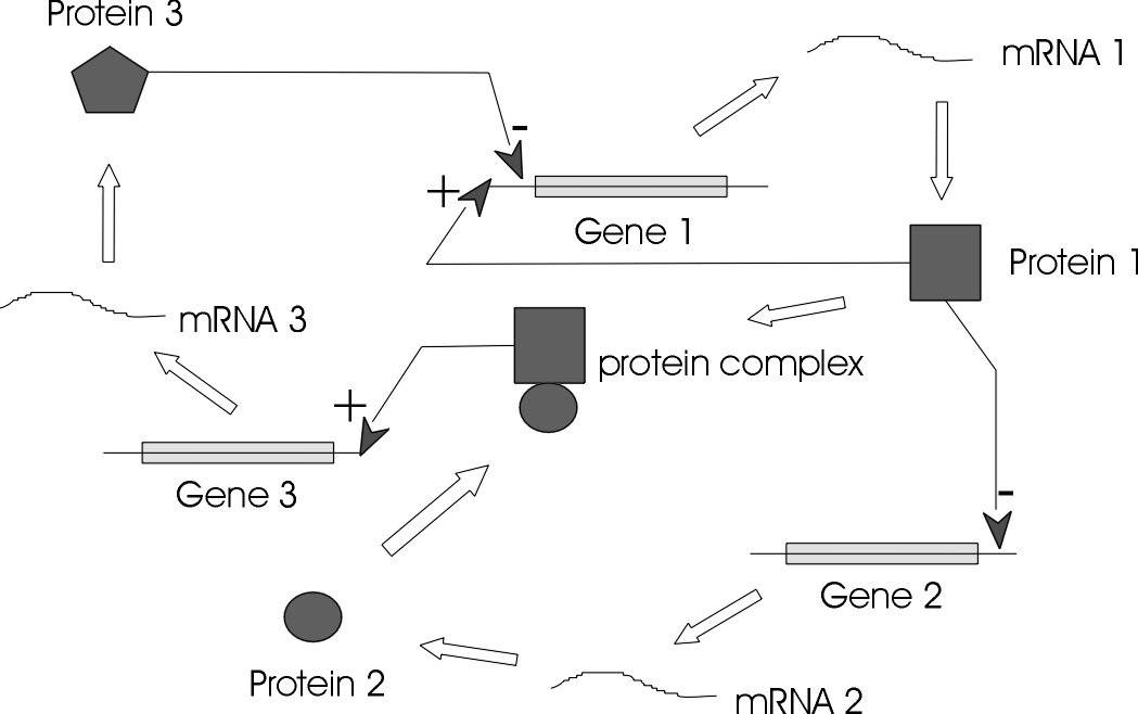
The genes, regulators, and the regulatory connections between them, together with an interpretation scheme form a gene network. Regulators are proteins, RNAs and other metabolites which can regulate (encourage or inhibit the expression levels) the genes. In general, each messenger Ribonucleic Acid (mRNA) molecule makes a protein (or set of proteins). Some proteins serve only to activate other genes, and these are called the transcription factors (regulators), the main players in regulatory networks. Each gene has a region called cis-region, where the regulator binds and turns them on/off, initiating the production of another protein, and so on[1].
A GRN represents the functionally related genes, that is, genes which are causally linked and not just correlated. GRN models can span from genetic interaction maps to physical interaction graphs to models of network dynamics and gene expression kinetics.
What is microarray data?
Microarray Data or Gene Expression Data represents expression of genes in a particular tissue of the body under certain experimental conditions. A DNA microarray (also commonly known as DNA chip or biochip) is a collection of microscopic DNA spots attached to a solid surface. Scientists use DNA microarrays to measure the expression levels of large numbers of genes simultaneously. Each DNA spot contains picomoles of a specific DNA sequence, known as probes. These can be a short section of a gene or other DNA element that are used to hybridize a gene sample (called target). Probe-target hybridization is usually detected and quantified by detection of fluorophore, silver, or chemiluminescence-labeled targets to determine relative abundance of nucleic acid sequences in the target. Microarray data can be used to model the GRNs.
Different methods for modeling GRNs
There are a variety of modeling techniques that can be used for representing GRNs[2]. Some are summarized below.
Graph Theoretical Models
A Graph Theoretical Model (GTM) describes the topology/architecture of a gene network. It describes the feature relationship between genes and possibly their nature. GTMs are particularly useful for knowledge representation.
Gene networks are represented by graph structure, \(G(V, E)\), where \(V\) (\(V \in \{1, 2, 3, \ldots, n\}\)) represents the gene regulatory elements (genes, proteins) and \(E\) (\(E = \{(i, j) \mid i, j \in V\}\)) represents interactions between them (activation, inhibition, causality, binding specificity). The edges can be directed, indicating that one node is the precursor to other or weighted, indicating the strength. The nodes and edges both can be labeled with function or nature of the relationship (activator, activation, inhibitor, inhibition, etc). Graph theory is pretty much the mathematical concept used here.
Bayesian Networks
A Bayesian network is an annotated directed acyclic graph, where the nodes represent random variables (gene in our case) and the edges indicate the conditional dependencies between the nodes (genes). Each node is associated with a probability function that takes, as input, a particular set of values for the node’s parent variables (parent genes’ expression values), and gives the probability (or probability distribution, if applicable) of the gene represented by the node. The technique is based on the assumption that given a gene’s parents, each gene is independent of its non-descendants. Thus, Bayesian network uniquely specifies a decomposition of the joint distribution over all variables down to the conditional distributions of the nodes [pdf][pdf]. The figure below (taken from wikipedia article), explains the basic concept behind a Bayesian network.

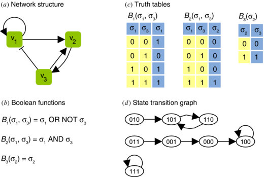
Boolean Networks
A Boolean network is a directed graph, where the nodes are boolean variables (genes) with an associated boolean function. Each gene is represented by a node and state of each node is determined by the boolean function associated with that gene. Assuming an ideal situation, each node has two states - on or off (1 or 0). At any given time, the states (values) of all nodes represent the state of the network. All states’ transitions together correspond to a state transition of the network from \(S(t)\) to the new network state, \(S(t + 1)\). Synchrony is another assumption of the boolean networks. Thus, whole network transits from state, \(S(t)\) to \(S(t+1)\) from time, \(t\) to \(t+1\). A series of state transitions is called a trajectory[pdf].
Pre-processing
Data-gathering methods are often loosely controlled, resulting in out-of-range values, impossible data combinations, missing values, etc. Analyzing data that has not been carefully screened for such problems can produce misleading results. Thus, the representation and quality of data is first and foremost before running an analysis. Data pre-processing includes quality control, cleaning, normalization, feature extraction, etc.
Pre-processing in this study
Microarray analysis techniques are many, as the wiki article shows. What this study used were,
-
Quality Control (QC) assessment is a crucial first step in successful data analysis. Before any comparisons can be performed, it is necessary to check that there were no problems with sample processing, and that arrays are of sufficient quality to be included in a study. Some methods for QC checks are - visual inspection of chips, pairwise comparisons or analysis of RNA degradation. Also, if a data set has been used in a well received publication then the chances are high that, that dataset was of preferred quality.
-
Normalization is a broad term for methods that are used for removing systematic variations from DNA microarray data. In other words, normalization makes the measurements from different arrays inter-comparable. The methods are largely dissimilar for different DNA microarray technologies. This Introduction to normalization approaches kind of hits the topic on the spot. Background correction & Robust multi-array average (RMA) are the methods used here, for normalizing microarray data.
Background correction, is the process of removing non-specific binding (mismatched spots) or spatial heterogeneity across the array. One usual (widely used) way of achieving this is subtracting the average signal intensity of the area between spots, but other methods exist as compared here in this publication.
In RMA, the raw intensity values are background corrected, log2 transformed and then quantile normalized. The log2 transformation is to make the variation of expression values similar across orders of magnitude. Quantile normalization normalizes the arrays to be further meaningful in the comparisons.
-
Filtering, is to exclude some part of the data based on the expression of genes. There are two kinds,
Unspecific filtering, methods for excluding a certain part of the data without any knowledge of the grouping of the samples. It is typically used for excluding any uninteresting genes from the dataset. Genes that are not changing at all during the experiment or are expressed on a very low level so that their measurements are unreliable, are usually excluded from further analyses. If the filtering is truly unspecific, then no bias has been introduced to the statistical testing, and its results should be valid. If in doubt whether to filter or not, one can always first run a statistical test, and after that use unspecific filtering. I used this in this study, that is, filtering before and after running a statistical test. Thus, 2 sets of results were generated.
Specific filtering, is used in situations when the filtering is affected by the known grouping of the samples. For example, in a case-control study genes could be removed from the data using some statistical test or some other method that requires group knowledge.
Statistical Analyses
Statistical analysis of DNA microarray experiments is still under heavy development. There are no consensus, no strict guidelines or real rules of thumb when to apply some tests and when never to apply certain other tests. One of the widely used tools for the statistical analysis is limma, which implements linear models. One of the assumptions of the limma’s method is that the data is normally distributed (otherwise the significance tests give wrong results), but the real world data is not always normally distributed. However, usually the same method is used for all genes, and the results are therefore only approximate. One can probably rank the genes according to the p-values, but assuming that the p-values are unbiased in the traditional statistical sense is an illusion.
Gene Set Enrichment Analysis (GSEA)
GSEA is used to describe all methods that are used for statistically testing whether genes in our list of interesting genes are enriched in some pathways or functional categories. Typically these methods employ hypergeometric test based statistics. In a hypergeometric experiment we randomly select a sample of size \(n\) (without replacement) from a population of size \(N\). In the population, \(k\) items can be classified as successes and \(N-k\) as the failures. The probability of getting exactly \(x\) successes in \(n\)-trials in a population of \(N\) items is termed as, hypergeometric probability and the probability distribution obtained by taking the number of successes as a hypergeometric random variable is called a hypergeometric distribution[1, 2], given as follows,
\[P(X=x) = f(x; N, n, k) = \frac{\binom{K}{x} \binom{N-k}{n-x}}{\binom{N}{n}}\]For example: We have 36 balls (\(N\)) (6 good balls (\(k\)) and 30 bad balls (\(N-k\))). So, the probabilities of getting \(i\) good balls out of 6 balls drawn is generated by the following code.
1
2
3
4
5
6
7
8
9
10
11
12
13
14
15
16
17
18
19
20
21
library(ggplot2)
library(gridExtra)

m <- 6; n <- 30; k <- 6;
x <- 0:(k+1)

# dhyper calculates the probability values.
a <- data.frame(x=0:7, y=dhyper(x, m, n, k))
mytable <- cbind("Good balls"=0:7, Probability=round(dhyper(x, m, n, k), 8))

png("hgeo.png", width = 640, height = 560, pointsize = 3)
g <- ggplot(a, aes(x=x, y=y)) +
    geom_line() +
    scale_x_continuous(breaks=0:7) +
    annotation_custom(tableGrob(mytable), xmin=5, xmax=7, ymin=0.3, ymax=0.4) +
    theme_bw() +
    xlab("Good balls obtained") +
    ylab("") +
    ggtitle("Hypergeometric Distribution")
print(g)
dev.off()
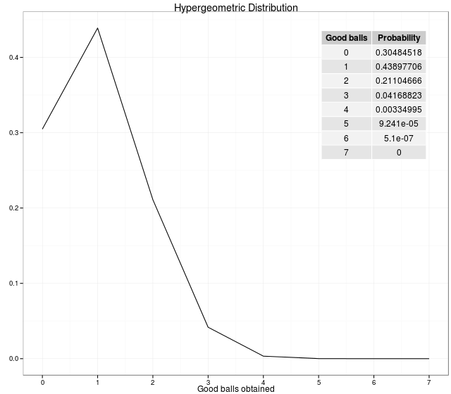
In statistics, the hypergeometric test uses the hypergeometric distribution to calculate the statistical significance of having drawn a specific k successes (out of n total draws) from the population. The test is often used to identify which sub-populations are over- or under-represented in a sample.
GO categories
Gene ontology (GO) is a major bioinformatics initiative to unify the representation of gene and gene product attributes across all species. More specifically, the project aims to:
- Maintain and develop its controlled vocabulary of gene and gene product attributes.
- Annotate genes and gene products, and assimilate and disseminate annotation data.
- Provide tools for easy access to all aspects of the data provided by the project, and to enable functional interpretation of experimental data using the GO, for example via enrichment analysis.
An ontology is a representation of something we know about. “Ontologies” consist of a representation of things that are detectable or directly observable, and the relationships between those things. The ontology covers three domains:
- Cellular component, the parts of a cell or its extracellular environment.
- Molecular function, the elemental activities of a gene product at the molecular level, such as binding or catalysis.
- Biological process, operations or sets of molecular events with a defined beginning and end, pertinent to the functioning of integrated living units: cells, tissues, organs, and organisms.
Each GO term within the ontology has a term name, which may be a word or string of words; a unique alphanumeric identifier; a definition with cited sources; and a namespace indicating the domain to which it belongs. The GO ontology is structured as a directed acyclic graph, and each term has defined relationships to one or more other terms in the same domain, and sometimes to other domains. The GO vocabulary is designed to be species-neutral. The GO ontology file is freely available from the GO website.
KEGG pathways
KEGG (Kyoto Encyclopedia of Genes and Genomes) is a collection of databases dealing with genomes, biological pathways, diseases, drugs, and chemical substances. The KEGG database project was initiated in 1995 by Minoru Kanehisa, Professor at the Institute for Chemical Research, Kyoto University, under the then ongoing Japanese Human Genome Program.
It is a collection of manually drawn KEGG pathway maps representing experimental knowledge on metabolism and various other functions of the cell and the organism. Each pathway map contains a network of molecular interactions and reactions and is designed to link genes in the genome to gene products (mostly proteins) in the pathway. This has enabled the analysis called KEGG pathway mapping, whereby the gene content in the genome is compared with the KEGG PATHWAY database to examine which pathways and associated functions are likely to be encoded in the genome.
Clustering
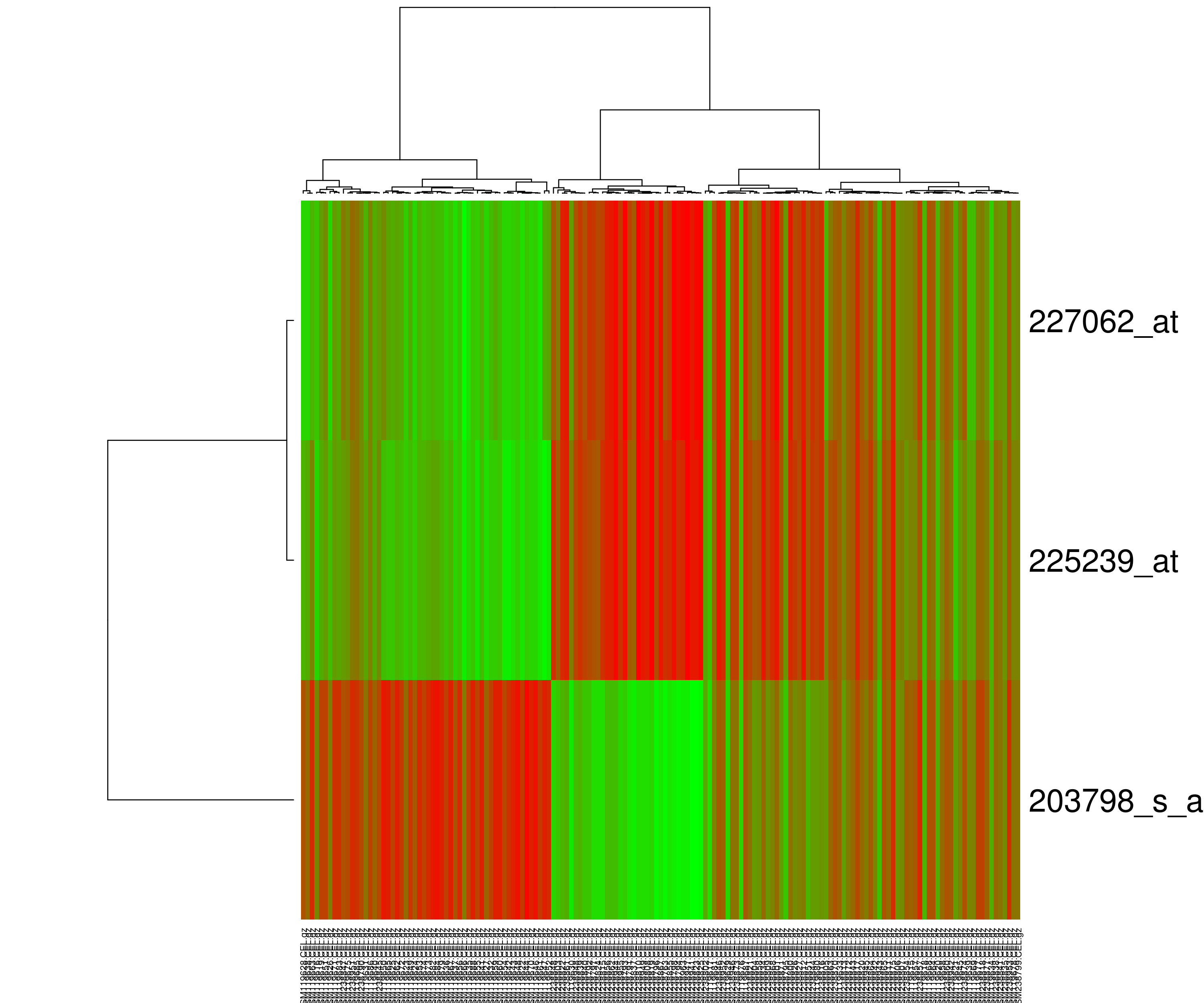
Heatmap or Hierarchical Clustering
Heatmap presents hierarchical clustering of both genes and arrays, and additionally displays the expression patterns, all in the same visualization. In order to decide where a cluster should be split (for divisive), a measure of dissimilarity between sets of observations is required. In most methods of hierarchical clustering, this is achieved by use of an appropriate metric (a measure of distance between pairs of observations using distance functions like Euclidean distance or Manhattan distance or Minkowski distance), and a linkage criterion which specifies the dissimilarity of sets as a function of the pairwise distances of observations in the sets. Some commonly used linkage criterias are complete-linkage, single-linkage or average-linkage.
The visualization of hierarchical clusters in a heatmap is shown with the help of dendogram. There are many different color schemes that can be used to illustrate the heatmap, with perceptual advantages and disadvantages for each. Rainbow colormaps are often used, as humans can perceive more shades of color than they can of gray, and this would purportedly increase the amount of detail perceivable in the image. However, this is discouraged by many in the scientific community. The usual coloring scheme for microarray data in heatmaps is to present down-regulated genes with green, and up-regulated genes with red.
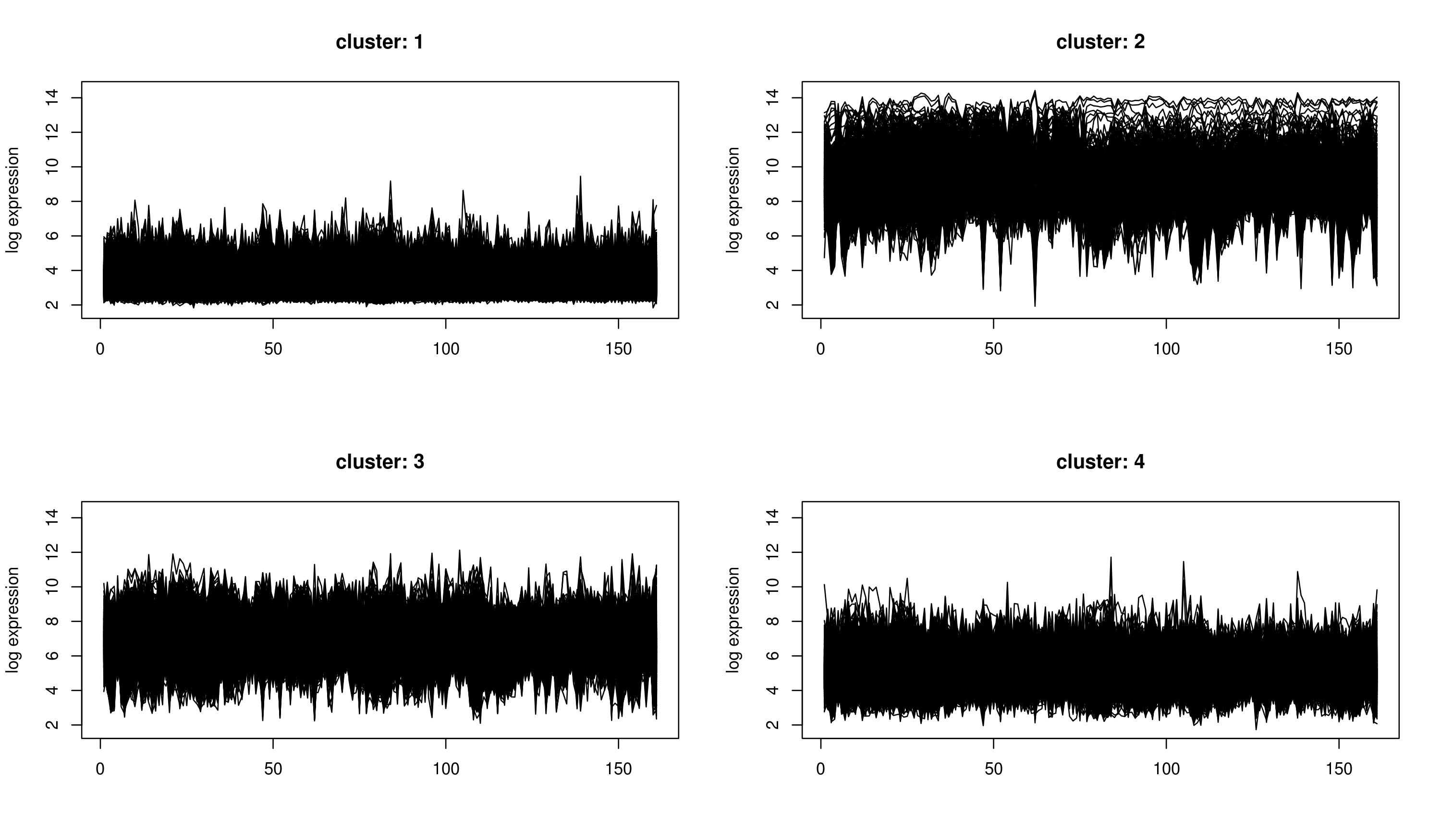
k-Means Clustering
k-means clustering aims to partition n observations into k clusters in which each observation belongs to the cluster with the nearest mean, serving as a prototype of the cluster. The problem is computationally difficult (NP-hard); however, there are efficient heuristic algorithms that are commonly employed and converge quickly to a local optimum.
k-means clustering does not produce a tree, but divides the genes or arrays into a number of clusters. In contrast to hierarchical clustering, k-means clustering is feasible even for very large datasets. However, before the analysis, user has to specify how many clusters should be returned. Unfortunately, there are no good rules of thumb for estimating the starting number of clusters before the analysis. Although, a technique will be discussed in next post which gives us a good estimate for the number of clusters in our case.
This above introductory description of the Genetic Regulatory Networks and concepts surrounding it, was necessary for the next post about the work. I am yet to build a proper GRN, but I am hoping to generate one by the next summer. Let’s see how it goes.